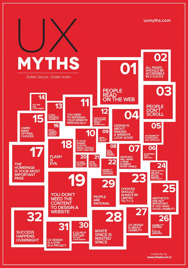
People have many misunderstandings and false assumptions about websites. I've encountered several while talking to businesses about their websites. I've found UX Myths to be a helpful resource, since it responds to myths with research. The site's tagline is "Build your website based on evidence, not false beliefs." Here's a summary of my favorite myths and realities.
Reality: People skim when reading on the web. Make text scannable and relevant.
Reality: What really counts is making navigation easy, not the number of clicks.
Reality: People are used to scrolling. You don’t have to squeeze everything above the fold. However, you should encourage people to scroll with your design and interesting content. Content above the fold still gets the most attention, and helps people decide whether to keep reading.
Reality: Design is more about how something works than how it looks. The goal of design is to efficiently solve problems.
Reality: Users usually overlook stock images. Use images related to the topic, and that add information.
Reality: Design conventions and standard patterns are more usable, because people know how to use them.
Reality: Minor website improvements over time are better, because people prefer familiar designs and hate change.
Reality: Text labels are more efficient than icons alone, because the label removes the ambiguity an icon can have.
Reality: Navigation links work better than a website's search feature. People scan the page looking for what they want, and only search if they can't find it.
Reality: A website's design is based on its content. People come to websites for content, not design.
Reality: Aesthetics influence emotion. A pleasing design can make a website seem more credible, and make it easier to use.
Reality: White space is important for readability, layout, and branding.
Reality: Success usually takes years of hard work and failure.
Reality: All users are distracted, and sites must be designed to deal with that. Here are useful facts about mobile web use.
It can be difficult to separate web design fact from fiction, especially if you're not a web professional. Did any of these open your eyes? Contact us if you want to talk about applying these realities to your website.
Super good list Chad! 2 & 3 have been big problems for me when discussing projects with others. It does seem like everyone wants to make it so you can get anywhere from anywhere and shouldn't force anyone to do any looking. Silly.
I'm not sure I know exactly how to phrase it but another issue I frequently end up debating is the importance of giving a user what they expect. When making a button or call to action, it is critical that the link accurately conveys the actual destination. Things like Learn More or Buy Now buttons are common problems. Do they go to the product page, about page, pricing page, landing page, contact page, checkout page, etc.
Ya know, that may not be a myth and I'm just ranting because I read this and for each item I think I've had a client or colleague contest that so it brought others to mind. Sorry.
Right, the myths All pages should be accessible in 3 clicks and People don’t scroll can lead to crowded navigation and an overwhelming, unfocused homepage. It's better to provide just enough info to persuade and guide; you can always give more info later.
I agree that links and CTAs should be descriptive. Context matters too; for Buy Now on a homepage or in a blog post, it may be OK to link to a page describing the product/service, rather than adding it straight to a cart. However, if you're already in the store section of a site, then one might expect Buy Now to add it to the cart, or at least start that checkout process. In that case, though, Add to cart would probably be a better choice, as it's more specific.
I wrote a post about using keywords in link anchor text for the sake of SEO and humans.