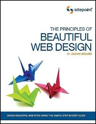
The Principles of Beautiful Web Design by Jason Beaird
My rating: 5 of 5 stars
An excellent introduction to the artistic side of web design. Beaird teaches that a site’s design should reinforce the identity of the organization, and expertly shows how to use layout and composition, color, texture, typography, and imagery. He explains the concepts of design theory, then applies them to a website that he builds throughout the book.
The book is full of colorful illustrations and screenshots from many websites. I read the first edition from 2007, so the specific CSS and graphics tips are slightly dated, but the theory is timeless.
I really liked this book; it was nice to take a break from reading about HTML and CSS to learn about the art involved in web design. Below are the notes I took while reading.
Layout & composition
- Use a 9-square grid for layouts. This follows the rule of thirds, which approximates the Golden Ratio.
Color
- To choose a color scheme, think about the feelings you want to inspire in the target audience.
- Use the Color Scheme Designer to choose colors.
- Use warm colors for emphasis and cool colors for backgrounds and large elements.
- Use a standout color for the navigation or header.
- Use Jonathan Snook’s Colour Contrast Check to confirm that there’s enough contrast between colors.
Color associations
- Red: stimulates adrenaline and blood pressure, and increases metabolism. Exciting, dramatic, and rich. Color of passion and love. Darker shades such as burgundy and maroon are rich and indulgent. Earthy, brownish shades associated with fall and harvest.
- Orange: active and energetic. Promotes happiness. Represents sunshine, enthusiasm, creativity. Informal, not corporate. Stimulates metabolism and appetite; great for food and cooking.
- Yellow: active and visible. Associated with happiness and energy.
- Green: associated with nature. Soothing color symbolizing growth, freshness, and hope. Easier on the eyes than yellow, orange, or red.
- Blue: openness, intelligence, faith. Calms and reduces appetite. Sometimes symbol of bad luck and trouble. Associated with water, sky, and air. Conveys sense of stability and clarity of purpose.
- Purple: royalty and power, wealth and extravagance. Connected with flowers, gemstones, and sunsets.
- White: clean; the color of perfection, light, and beauty.
- Black: often has negative connotations such as death and evil, but can also represent power, elegance, and strength.
Texture
- Make the layout feel less geometric/rectangular, and more smooth and organic.
- Rounded corners provide a smoother, more organic feel.
- Include familiar organic shapes.
- Break up vertical lines.
- Incorporate 3D space using light and shadow.
Typography
- Choose fonts that elicit the right emotions in the audience.
- Typophile.com is a great place to learn and discuss typography.
- Compare font settings with Typetester.org.
- Use a sans serif font for body text.
- Don’t use more than 4 fonts in a website. Avoid combining 2 different serif fonts or 2 different sans serif fonts.
- Free and shareware font galleries: 1001fonts.com and DaFont.com.
Imagery
