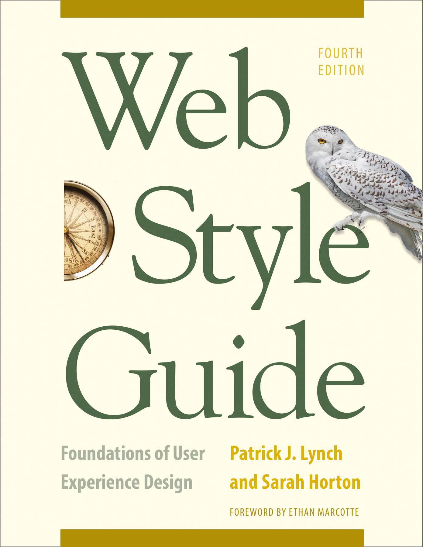
Web Style Guide: Foundations of User Experience Design by Patrick J. Lynch
My rating: 4 of 5 stars
This is a practical, high-level resource that covers a wide variety of topics related to user experience (UX) design for the Web, including strategy, information architecture, site structure, page structure, interface design, graphic design, typography, images, and video.
Because it addresses so many topics, it doesn't go very deep into any of them. It explains both theory and practice, giving many examples. It cites many experts in web design, UX design, and content strategy.
I read this to ensure that we at OptimWise are following UX best practices.
Below are my notes from the book.
Note: This page contains affiliate links. As an Amazon Associate, I earn from qualifying purchases. Please see Affiliate Disclosure.
A concise, high-quality site is much better than a big contraption full of broken links.
Prefer the standard to the offbeat. Favor tried-and-true web conventions, and save creativity for content and features.
Do visuals last; form follows function.
Avoid gimmicky tech fads. Don't add them to make sight more interesting; use content and features to do that.
Make content easy to scan, with headers, subheads, lists.
Use active voice.
2/3 of software features are never or rarely used.
Content development is the hardest, most time-consuming, and most consistently underestimated the part of any website development project.
Continually improve site with small, incremental changes, rather than periodic large redesigns.
Simple is fast, simple is cost-effective, and simple is almost always easier to use and maintain.
Keep content as concise as possible, and aggressively prune unneeded or outdated content.
Users prefer broad, shallow top-level navigation (more options) over narrow, deep navigation (fewer options).
"Hamburger menu" icon (☰) is called "trigram" or "navicon."
Navigation inside bars usually go on the left, but can go on right.
Try to put critical info in the top 600 pixels (above "the fold"), but don't worry too much about it, because users scroll.
Users prefer menus of at least 5-7 links, and prefer a few pages of organized choices over many layers of oversimplified menu pages.
About 2/3 of users prefer to initially browse a site; about 1/3 prefer to initially search a site. 92% use search at some point.
"It doesn't matter how many times I have to click, as long as each click is a mindless, unambiguous choice." Provide a clear path with self-explanatory labels.
Mega menus can be disorienting for impaired users, and don't work well on mobile devices.
80/20 rule applies to website features; 20% of features are used 80% of the time.
Some studies say serif fonts are more legible, and others say sans-serif fonts are. It depends on the specific font and its contexts.
Underlining links in body text ensures that users who can't see color can recognize links.
JPEG is best for photos and complex color illustrations, and PNG is best for line art, text, logos, icons (images with large areas of homogenous color with sharp transitions between colors).
You can buy Web Style Guide: Foundations of User Experience Design as an ebook or book on Amazon.
If you're building your own website, this book will introduce you to concepts that will help. Although there’s a lot you can do on your own, you’ll get the best results from working with professionals who have years of experience building websites. Contact us to see how we can help with your website.